Chop Chop by Nanyaa had a genuinely great product and a brand that disappeared into the background. Customers were buying on taste alone — there was nothing in the visual identity that made them proud to share it, recommend it, or come back for more.
The gap wasn't in the product — the product was already excellent. The gap was between what the brand said and what the product deserved. A rebrand here wasn't cosmetic. It was a business decision: give the product a visual identity as good as what's inside the packaging.
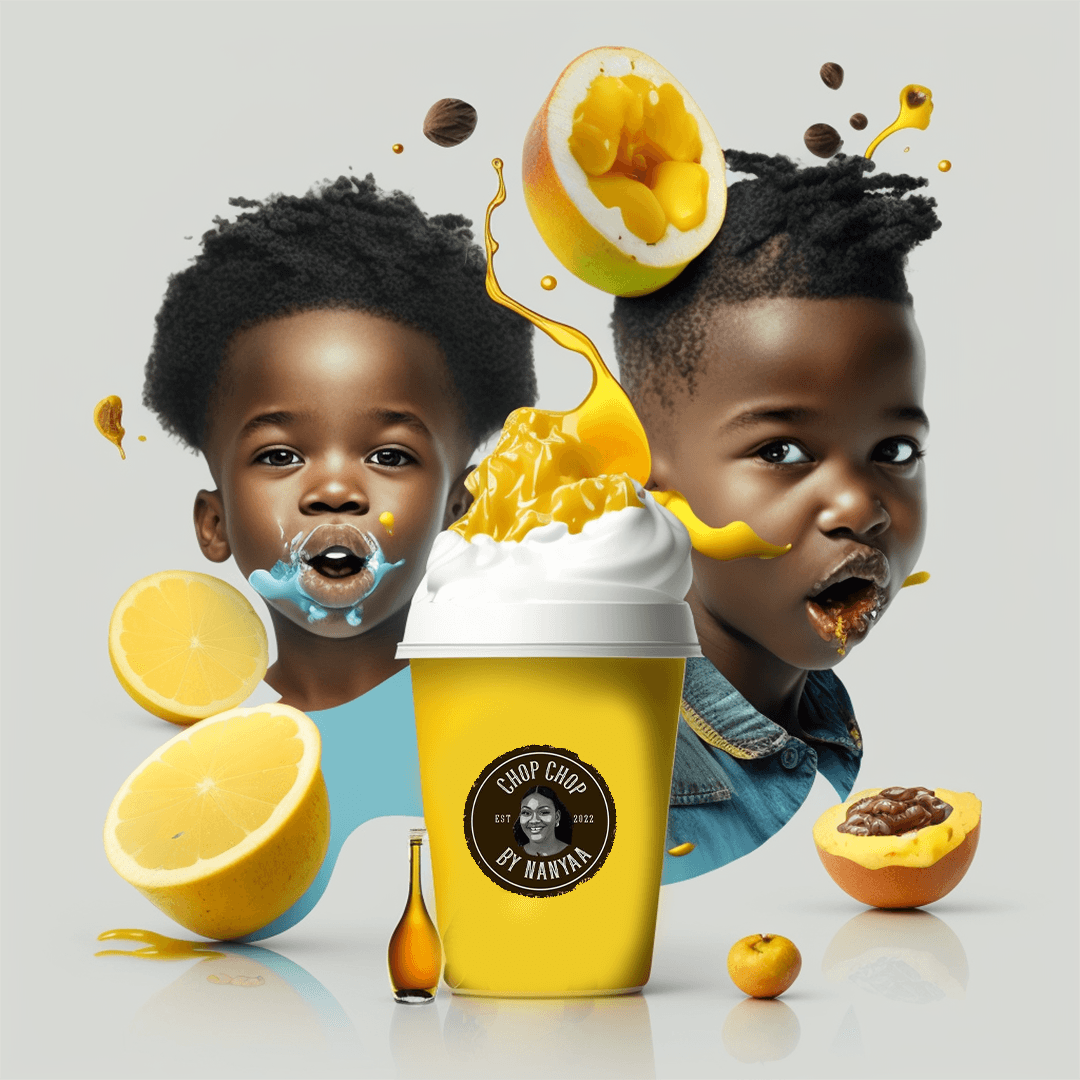
Rosario rebuilt the brand from the ground up. The colour system — bold yellow as the primary, with warm supporting tones — was built to own shelf space and be instantly recognisable. The logomark was redesigned to communicate pride and quality. Packaging was redeveloped across every physical touchpoint. Brand guidelines were delivered to ensure consistency.
The brand became the product's biggest selling point. New customers began commenting on the packaging before tasting the food. The founder — who had never been a fan of yellow — began repping the brand publicly, proudly, and loudly. When the person who knows the product best becomes its most enthusiastic ambassador, the rebrand has done its job.
"There's nobody that looks at our products now that doesn't first compliment the branding and packaging. I've never been a fan of yellow but guess who is repping it with pride? ME! All thanks to Rosario for the excellent job."